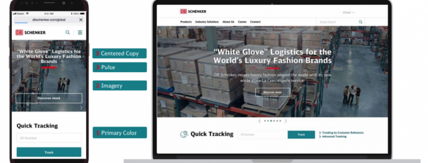
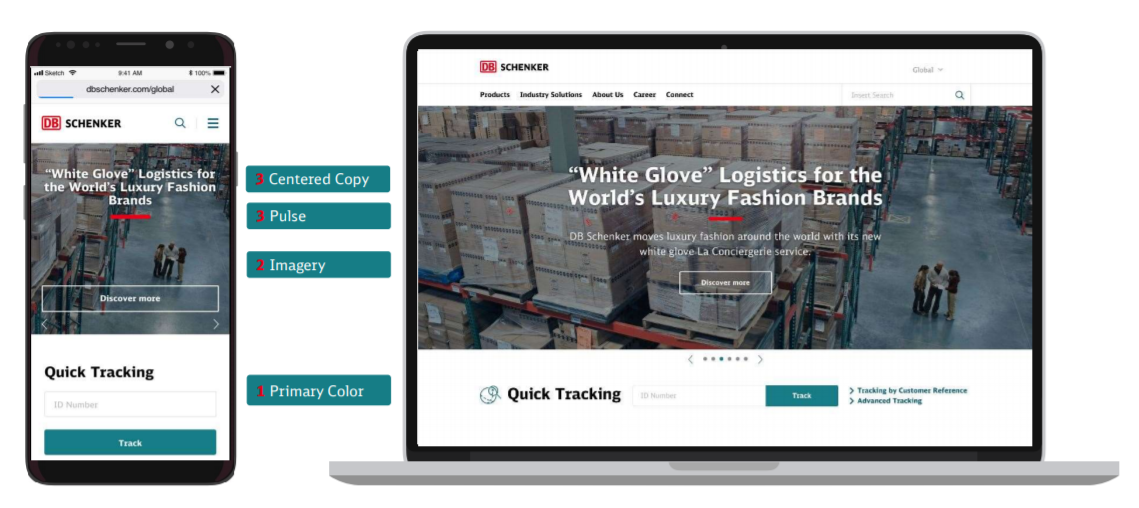
Presenting the New DB Schenker brand on the global website

As a global market player, DB Schenker seizes opportunities that lay ahead. The demanding circumstances were challenging for the business, but also inspired a change; a change that reflects what is best in DB Schenker: energy, future orientation, respect for tradition, and innovation. With our new branding, we create a clear vision for our future while aligning our brand with our values and culture. Implementation of the new branding on the global website and more than 100 country pages was a challenge for a website squad working in DB Schenker Technology Center within the Global Digital Solution team.
The changes in the brand image relate to several visual aspects. Our new branding elements are optimized for an open layout, providing the opportunity for increased flexibility, which is essential in the digital world. The unique, new imagery portraying DB Schenker employees highlights their positive spirit and can-do attitude. Slices of everyday life at work of our experts are being set in sceneries and landscapes that accent best values nurtured by the company: the ability to challenge the status quo, aiming at best customer experience, and being the trendsetter in the world of logistics. All those innovative concepts are now present on our corporate website, which has been the first DB Schenker digital application to be rebranded.
The website squad from Global Digital Solutions, working at DB Schenker Technology Center in Warsaw, has been preparing for the change during the last two months. The grand finale happened on June 2nd when the new DB Schenker brand image's external launch was planned. On that day, the website triumphantly presented its new face on all more than 100 local DB Schenker websites all over the world.

The team is introducing changes related to rebranding iteratively: the base of presenting the revamped branding is the new DB Schenker color – the Teal. "We have identified teaser pics used on all our sites (ca. 15 500 unique URLs) containing the old coloring. Initially, we have found over 2 400 copies of them! Luckily, we managed to extract less than 100 unique pics. We have created their .svg equivalents and - with the use of a script developed for the purpose of this exercise – replaced all .pngs and .jpgs with their vectorized counterparts. The designed solution will allow for automated adjustments in the future when the need arises" - says Magdalena Sass, Service Manager at Global Digital Solutions.
Additionally, the brand elements such as fonts and rounded corners of images and surfaces have been modernized. Still ahead awaits an introduction of entirely new functional icons, also designed to express the company's energy thanks to the inclusion of the Pulse. The Pulse is a novel branding element, the red line taken from Deutsche Bahn branding. It supports emotive microbranding and invigorates our digital appearance and offline communication as a recognizable illustrative element.
The website rebranding meant a lot of work for the whole website squad, and we hope the end result was definitely worth waiting for and next iterations will be published soon!